Color in fashion and interior
If you always dreamed to learn about how fashion appears for a particular shade and also why all architects, decorators and designers (including fashion), suddenly, as a conspiracy, use in their design projects a similar palette, we will tell you a secret. Everything is quite simple: lists of fashionable shades are formed by specialists of the American institute of color Pantone Color Institute, which at the beginning of each year announces the favorites of the next season. Their recommendations become a guide to action, including the development of interior design.
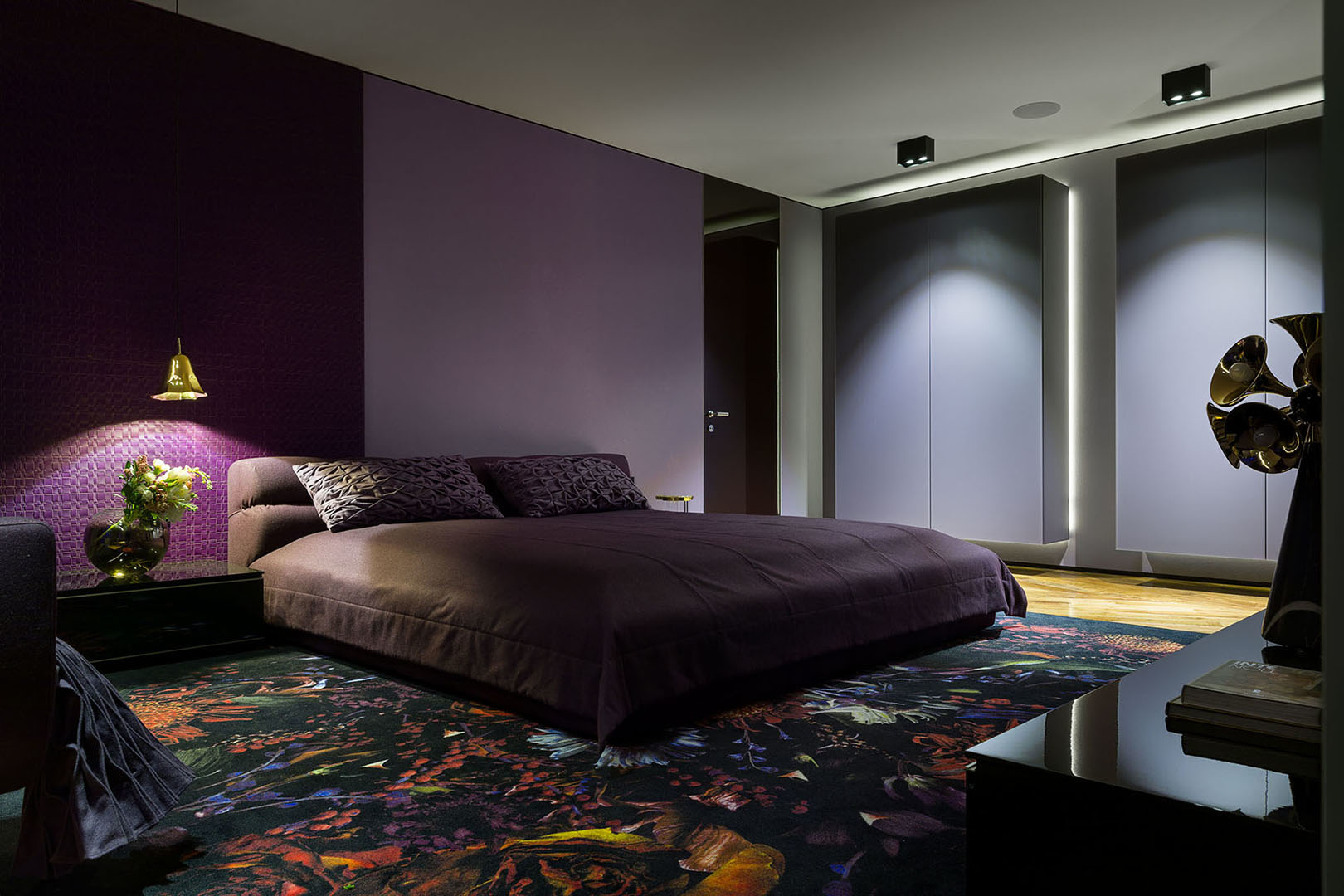
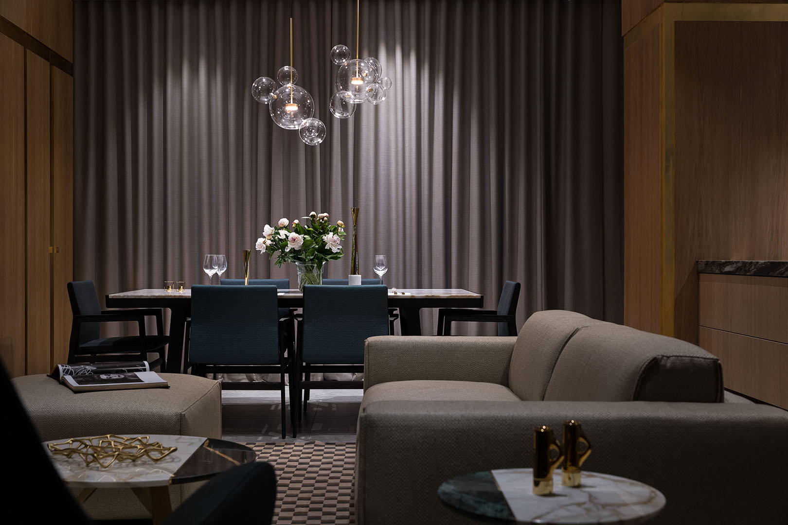
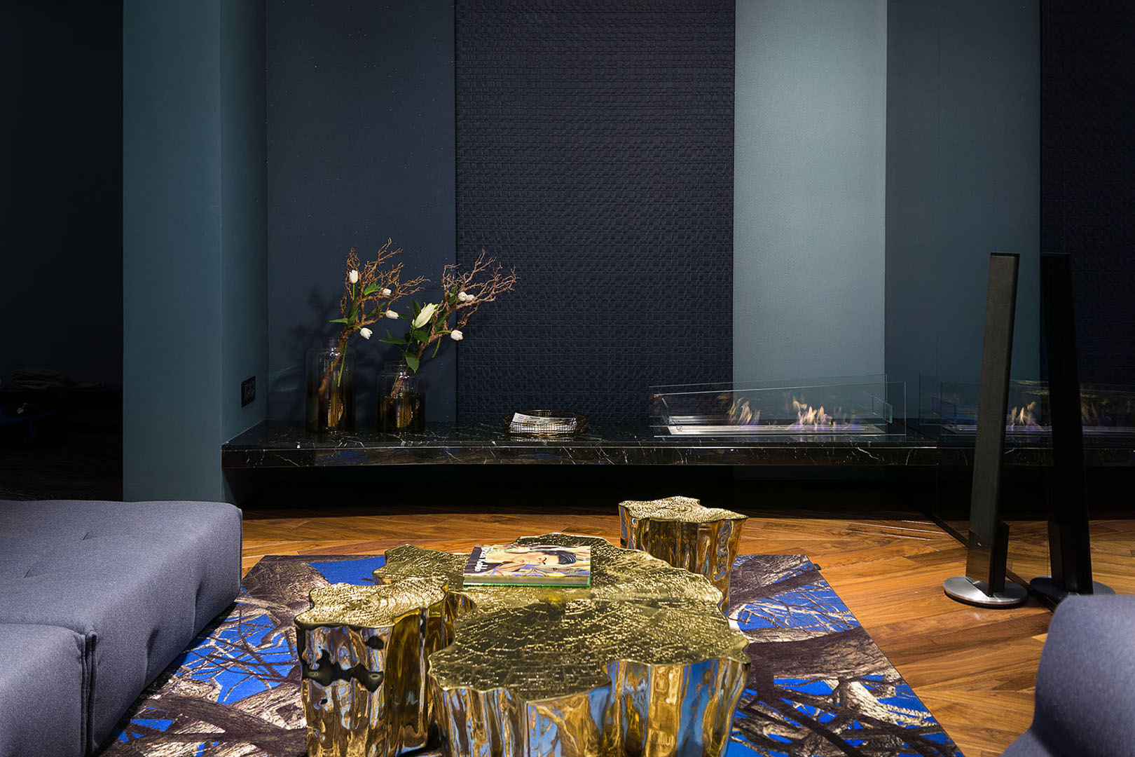
Monochrome solutions will not surprise anyone today. Of course, such a combination can be called a win-win situation, however, modern realities are adjusted to the manifestation of individuality. To solve this problem, architects will be helped by a more daring, rich color scheme, like the one we recommended in early 2018,” says Leatrice Eiseman, CEO of the Pantone Color Institute. So what does the color institute suggest to use? The palette of autumn-winter 2018 includes ten unusual shades, including the cosmic ultraviolet, announced as prime in 2018.
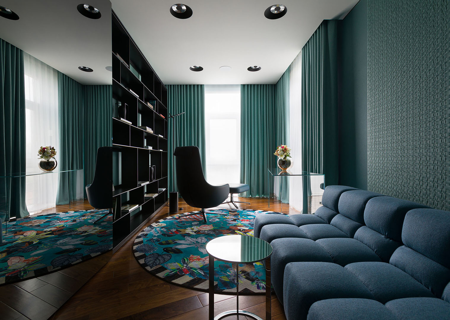
And besides it: a red pear, a courageous poppy, Ceylon yellow, a crocus petal, a sorrel orange, Martini with olives, a blue nebulosity, a spotlight and a quetzal green.
However, we want to remind you that despite the trends, yet you should listen first of all to yourself and to the designer, whom you entrusted to formalize your personal space, because this is also a manifestation of individuality.