PRAGMATIKA
Yuriy Zimenko and his blue
When we agreed to conduct an interview with designer Yuriy Zimenko, he chose dark blue without hesitation. And then it turned out during the conversation that he doesn’t particularly like blue in the interior and uses it in doses. Yuriy's superpower is to mark out a balance. This is a key concept in his coordinate system. Balance between interior and facade, between work and personal time, balance of colors, senses and textures in space.
Indigo
I think that I didn’t receive the aesthetic impressions, which I needed so much in my childhood. I grew up in the Soviet Union, where there was a shortage of beautiful pictures. There was no beauty either in architecture, or in clothes, or in magazines, or on TV. I liked expensive toys that my parents could not afford: airplanes, railways, houses that could be glued together. Later I realized that they attracted me with small details, perfection of forms and technical complexity.
People had no time for aesthetics, they evaluated things by country of origin. “Italian boots”, “сzech wall”, and no one asked about the color or size – these items were immediately bought. And even that was considered to be a good luck.
When a child, I went to the radio hams’ group in the House of Pioneers. Radio engineering was popular among boys, and I went there with a friend. The group turned out to be absolutely alien to me. But this was a reason to go to Arsenalnaya, walk along the beautiful streets of the center of Kiev, and get into the building of the House of Pioneers. I remember its small steps, carpets, windows with a stunning view of the Dniepr. I also liked the Monument of Glory and Gorodetskogo Street.
Blue bird
I caught my bluebird of happiness when I started working in design. However, my true-life choice was predetermined, just until a certain moment I didn’t see this and didn’t take my hobby seriously.
I graduated from school of medicine and was going to be a doctor. There were eight years of swot behind, it was a crucial point to turn around just change my mind.
At that time, I already tried myself in windowdressing. This occupation delighted me much more than working at the appointment with a patient. I felt that I could be a happy person who does his thing, or work in the specialty that considered prestigious at that time, but did not bring joy to me. Working without pleasure will harm both my professional growth and the people I will treat, and this is a great responsibility.
Everything was decided within ten minutes. I sat down in the hospital corridor, looked at the blue walls with traces of the fungi, at the people in yellowish surgical coats with no shapes. In their lives there was no place for dreams, trips and everything that I needed. Many of these people had happy eyes — they liked where they were and what they were doing. And I felt that I didn’t like being there and that I was not happy. With this emotion I took a piece of paper and wrote a letter of resignation.
During my studies at the institute, there was not even a hint of the profession of a designer. There were no such educational institutions, courses or people who would do this. I did not know that such a path was possible, in our country it didn’t exist in principle.
Now it is important for me to maintain an interest and a sense of novelty in the profession. I want to maximize my creative potential, to achieve the level of success that gives more freedom.
Blue blood
I divide true taste into innate and acquired. Innate allows you to enter a creative profession, develop in it and achieve better results. And the acquired one helps to dress prettily, to enjoy traveling, good hotels, cuisine, communication with people, to form your own vision. Get an eyeful of experience from childhood gives acquired true taste.
There are many more people in the West involved in aesthetics than we are. In Italy, for example, many people grew up in beautiful quarters, went to beautiful parks and museums, lived in beautiful interiors, and imbued themselves with cultural heritage. It is hard to imagine that such people would then build nine-story panel houses or paint a 20-story building in peach color. Those who are capable of this are in the minority, and they will not be allowed to build what they want. Bad taste arises when there are gaps in experience, continuity and cultural legacy, when there is lack of education.
The same people in the West can create a pleasant and comfortable interior for themselves. They have a sufficient aesthetic basis for this. Designers also work there, but they are needed for more complex tasks. Working in design requires fundamental knowledge, a deep approach and a bright creative personality that cannot be replicated. In many countries, there is an architectural elite that forms cities, leads the way, and contributes baselines. And we only have individual originals, exception to the rules.
In Milan, you go out in the morning and plunge into the hustle and bustle of people buying a newspaper, drinking coffee, crunching with the croissants, you smell perfume, bloomers, freshness, hear the noise of the morning crowd. And you can't feel bad there. And it's a completely different story when you go out in the morning in a sleeping area of Kiev and see a huge turquoise sign of a beauty salon. And there is also a front door, a street, a porch, public transport, lawns along the road. In Kiev, when you see some kind of beauty that recharges you, it is better to stop in tracks. With the slightest turn of your head, your look strikes at certain something that brings you back to reality.
Balance of blue
In my early days as a designer, I created some repressed beige and brown interiors. I didn't perceive color, and the brightest thing in my wardrobe was a gray knitted sweater. But you can’t go that far in creative work and I understood that.
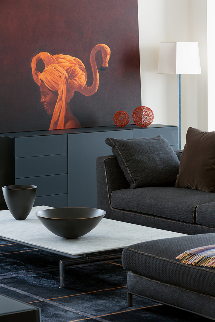
I needed to let the color in myself and the impressionist painters helped with this. Their painting attracted me and in a moment it came apart and changed something at heart. Immediately after that appeared a client who was ready for a riot of colors. It was winter and I had just arrived from Thailand to our colorless city. This is how the Color Object interior with blue walls occured. Perhaps, I was the first among my colleagues, who created an interior so bright in colors.
I love compound multicomponent colors. Sometimes factories give them unusual names, because such colors are difficult to identify, describe, and somehow unambiguously place a name. A color that contains shades of gray, beige, pink for example. Ten or even fifteen pigments can be mixed in it. If you look at this color for a long time, you can read them.
Colored objects stuck up nowise against a flat and unambiguous background. Simple colors do not give sophistication, there is no evolution in them. And complex shades look variously at different times of the day.
However, the difficulties begin when you start to select furniture that will stuck up good against the background of a complex color. The matter is that not all factories operate at this level of depth. High-priced factories work with such colors in textiles, while less expensive ones simply can’t afford such complex technologies.
Dark blue is my favorite color in clothes. Especially sophisticated blue like Ralph Lauren fabrics. The color of the sky that reflects turquoise. I am interested in shades with this degree of complexity where they fit many other colors. They are used for bags in the fashion industry so that they can be worn with a wide variety of clothes.
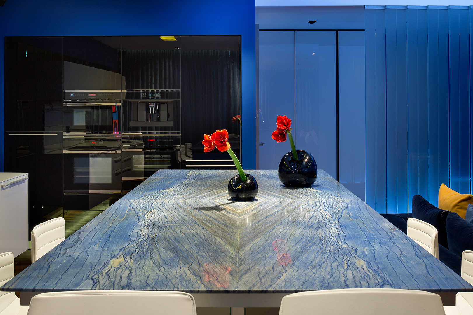
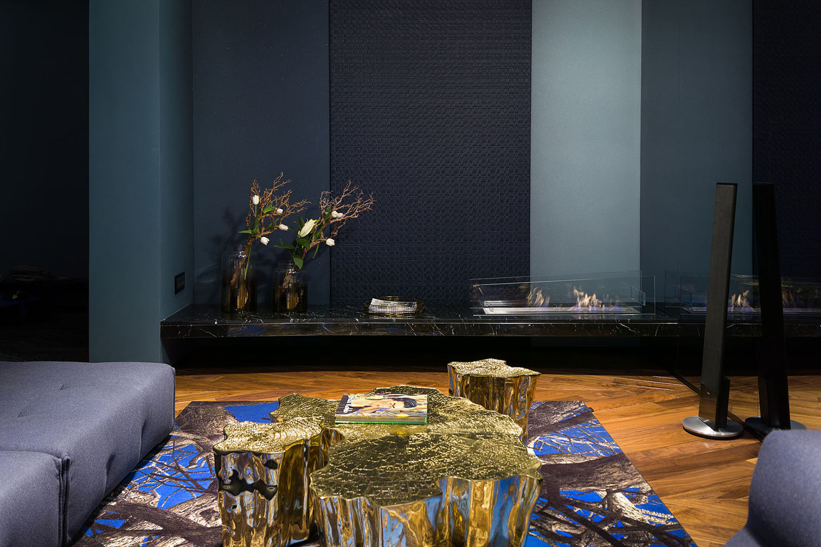
Blue in interior is as gold. It requires moderation and is more suited to detail. Solid blue as a background is too much for me. Moreover, pure blue is sad, it must be balanced.
Blue looks good in an interior with a lot of wood. They calm and complement each other. After all, the horizon pleases us when it has a balance of sandy shore and blue sky. It is also beautiful when the gray color of the mountains and the greenery of these mountains appear in this landscape.
I can work with any palette: from black and white to the Thai riot of colors. I'm interested in being different at the same time and keeping objects in parallel, in which there is a request for color and monochrome. Then I realize myself in several planes.
The level and amount of color in each project depends on the specific client. The interior is his world, his values and feelings. The client can allow me to bring something in if we feel the same and coincide in some subjects. But above all, as a professional, I create comfort for the client, not for myself.
Striped vest
The world of fashion inspires me endlessly. I recently reviewed documentaries about Yves Saint-Laurent and am still impressed by the colossal work capacity of this designer. It is difficult to imagine what effort it takes to create five collections a year, when you need to give out such a volume of creativity and maintain this frantic rhythm.
Among my favorite designers there are those whose work I relate to myself. My favorite garment right now is the black Dior coat, it's accentuated silhouette but a complete lack of flamboyance. One shouldn’t disappear in garment and it’s important for me. Indeed, it happens that a person walks and you see first of all glasses, a bag or even a mask.
There are designers whose work inspire me as a professional. This is McQueen, Vivienne Westwood, Balenciaga. Complexity, multicolor and richness of textures sound in their collections. They are holistic, meaningful, aesthetic. It is also striking what emotional intensity they manage to achieve during the shows. Such emotions can evoke in me a deep and professionally performed part song. This is art, you can’t name it otherwise. These are the projects I would like to create, but in interior design this is hardly possible. You need a sufficient budget and a customer who won’t interfere.
Blue carbuncle
I have a peculiarity – even in a completely ordinary store, I unconsciously choose the most expensive thing. Perhaps this is a scent for luxury, or the fact is that I am attracted to complex things that are expensive in production and materials.
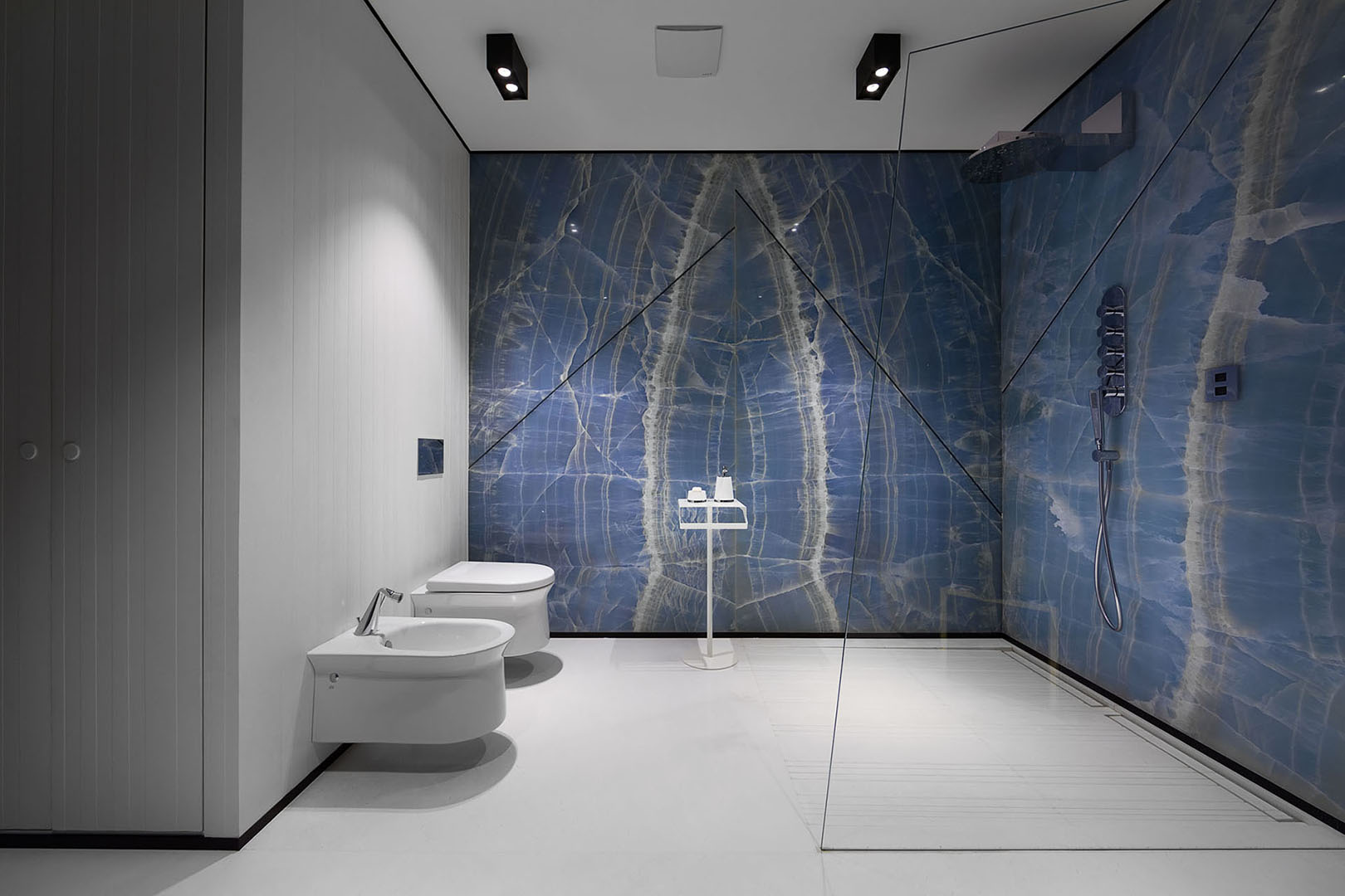
For each person luxury is something of his own. For some people it is a stunning view outside the window of a house with an ascetic interior. For me personally, luxury is natural materials. Marble, onyx, solid wood, complex fabrics with interweaving of many threads, multicomponent colors. This is always a reference to nature, the beauty of which we transfer and recreate in the interior. For example, drawing of natural stone on a carpet. It has shiny and matte threads, many shades, sophisticated technology and painstaking work.
Luxury is an opportunity for professional self-improvement. I would like to create an interior that is akin to art. With a minimum number of items, each of which is fitted in the space so that it cannot be rearranged or removed. This is aerobatics in aesthetics, a visual luxury in which function fades into the background. I would like to perfect this skill and develop it in myself.